User Flow Design - Diagram Types, Main Phases & Recommended Tools
Kicking off a new project and tempted to jump to the Information architecture and wireframing phase? I've been there too...

Statistics don’t lie: including verified customer reviews is one of the most effective ways to improve sales.
In fact, product reviews displayed on product pages increased conversion rates by a whopping 270%, according to a Spiegel Research Center study. And there’s more, 92% of shoppers admit that product reviews are often detrimental to their decision to purchase.
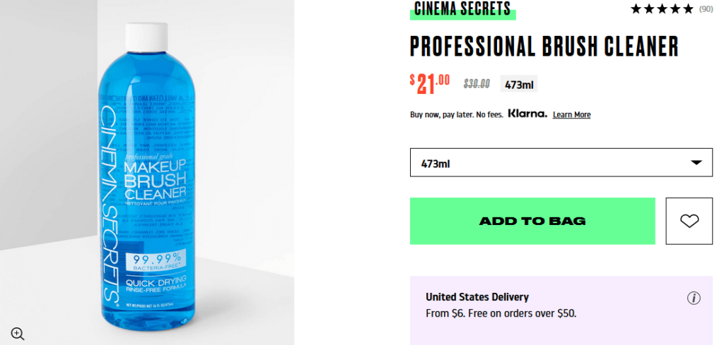
Beauty Bay lets customers rate and review products. In the top right corner, interested buyers can check what others who bought the item think about the product. Source: Beauty Bay
Displaying reviews also increases transparency—customers can include potential downsides of a product in their review. Equipped with detailed product information and verified reviews, a prospecting customer can make an informed purchase decision.
On the flip side, a lack of reviews can cause one-third of customers to postpone their purchase until they do more research.
Customers can’t get a feel of a product when shopping online. That’s why you have to let them see what they want in great detail. Remember, however, that merchant-provided photos of low quality can significantly decrease your chances of selling.
A Baymard usability study found that 56% of users explore product images before reading the description. Product images may as well be the most important product page content.
By showing customers high-quality pictures, you come off as having nothing to hide. Plus, you can highlight the best features of certain merchandise:
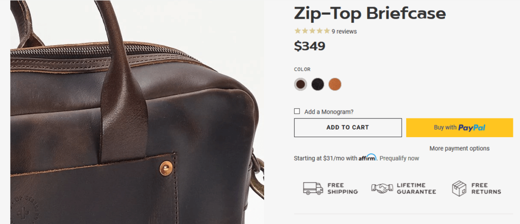
WP Standard shows customers the fine craftsmanship of its leather bags with zoomable, high-resolution photos. Source: WP Standard
Multiple-angle, high-quality product images help customers make a purchase decision. Also, uploading “in-scale” product photos give customers a real-life point of reference about the product’s size, further increasing your chances of selling.
Following a constant stream of data breach news, customers have become keenly aware of the importance of data security. Among the top reasons for cart abandonment, the lack of trust as to how customer credit card information is handled placed fifth:

Lack of trust about credit card information mishandling was cited by 17% of users why they resigned from a purchase. Source: Baymard
To rest customers assured that their data is safe, it’s worth investing in a trust badge from a reputable and widely recognized data security company.
Trust seals are small branded badges that tell users whether an ecommere website is legitimate and whether it is safe to entrust an online store with customer data. Companies offering trust seals diligently scan a website for possible vulnerabilities. They also check whether SSL/TLS certificates are in place, ensuring secure customer credit card information transmission.

Trust seals give consumers a sense of trust when shopping online. Source: Crazy Egg
A study conducted by Blue Fountain Media revealed that inserting a Verisign trust seal on a sign-up page resulted in a 42% increase in form completion.
Customers expect fast load times. It has gotten to a point where even search engines penalize slow-loading websites.
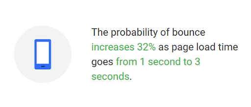
A slow website load time can hurt your sales. Source: Think with Google
With 6 seconds load time, the bounce rate increases to a mind-blowing 106%. Customers really don’t like waiting.
To test your product page and identify possible issues that slow it down, test it via a Google tool. Sometimes the culprit might be a cluttered website with too many redundant elements (files, pictures, broken links, etc.). Edit the product page so that it contains only the necessary elements from the customer’s point of view.
When a search engine redirects customers to an “out of stock” page, it’s almost always a “no-sale” visit. But not all is lost, even if you truly are out of stock. There are essentially two scenarios that can help you make a sale even when you’re out of stock.
If you’re expecting a reship relatively soon, you can allow a customer to make a purchase but be sure to include information about a possible delay in delivery on the product page. Remember, shopping online always involves a waiting period before the customer receives the goods. Take advantage of that.
Sometimes a line of products is discontinued. It happens in every industry. But don’t let that ruin a possible sale. Since you know what a customer wants, suggest alternative products in your online store or propose products with similar features and qualities.
Having a flourishing product page isn’t easy, and nine times out of ten, it ends with a failure. So imagining having the best and most modern design doesn’t mean you will make the new Amazon. Following simple rules of best practices and being always accurate can help to be a successful entrepreneur. UX/UI Designer
After that captivating first sentence, get right down to the product’s biggest features to emphasize the strong side of the merchandise. Bringing the tangible benefits upfront helps customers understand the product better and fully grasp its features.
The nitty-gritty details such as size, weight, and ingredients—if they aren’t what makes your product stand out—should be included later in the description.

This Dyson cordless vacuum cleaner featured on Currys UK has all the essential information bulleted out in the short description. Source: Currys
A one-second delay in load time for mobile devices can cause a 20% drop in conversion rates. And when you consider that an average mobile website takes as much as 15 seconds to load, you have a recipe for disaster.
Mobile phones have become a go-to device for shopping online. It’s, therefore, paramount to build mobile product pages with flawless UX that facilitates sales. The mobile consumer expects a flawless user experience, from intuitive navigation to a lack of clutter to fast load times. Faced with a bad one, 64% of shoppers are less likely to make another purchase from the same store.
It’s worth looking at ways to make your e-commerce even more user-friendly. One such solution, currently trendy, is Progressive Web Apps, which allow you to use mobile websites like a native app. Some studies show that it increases conversions on the site and user engagement.
When a customer is convinced about making a purchase, a call-to-action button should be clearly visible to prevent distraction—let the customer quickly add the product to the cart.

The “add to cart” button, along with a clear product image, is the most visible element on the product page. Source: Structube
Structube’s product page is a by-the-book example of a successful CTA button: vibrant, large, and contrasting with other colors on the product page.
Keep product descriptions detailed, but also make them easy on the eyes. It’s a common mistake to squeeze too much information to list out all the features and benefits. But this is more likely to confuse the customer. The description should be captivating, giving the customers essential information in a purchase-triggering form.
The recommended approach is to keep the above-the-fold product description neat and concise, only to reveal the full benefits below the fold.
Let’s look at how Garmin does it.

The top of Garmin’s product page has all the crucial information and modification options. Source: Garmin

As you scroll down Garmin’s product page, the description takes you on a journey through the watch details and possibilities of the device. Source: Garmin
A branded product video included in the description can also help show the product’s value proposition to your customers.
In a video on the product page, Garmin gives the customers the essence of its newest watches—heavy-duty, rugged devices. Source: Garmin
It’s easier for shoppers to purchase if they can see other buyers already enjoying a product. Enabling customer-generated content (CGU) on product pages is one of the easiest ways to promote your product and build trust with prospecting customers.
A survey made by Olapic found that 76% of customers trust user-generated content more than branded material.
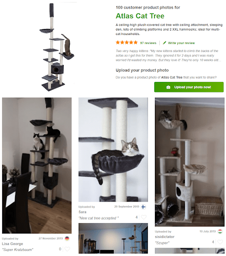
Zooplus encourages customers to share pictures of their pets using the store’s products. Source: Zooplus UK
You can also embed a “share” button to let customers easily share a product page with friends and family for feedback. To further increase trust and engagement, pair share buttons with the number of followers your brand has on popular social media platforms.
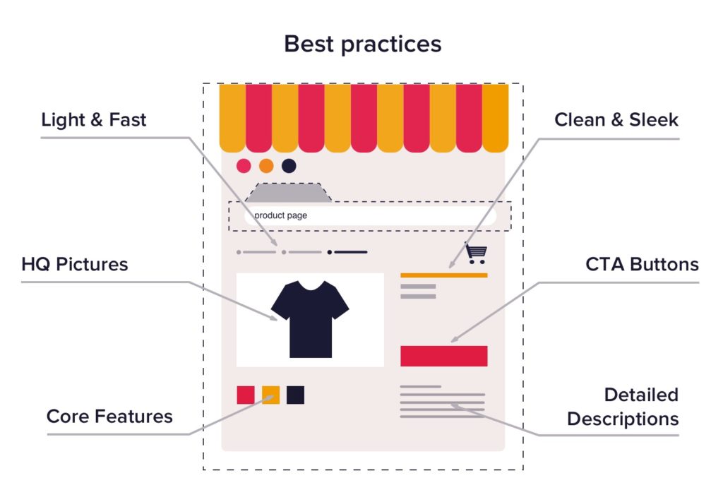
High-quality images, clear main features, and customizability options should be the three main points of your product page (and, of course, the call-to-action button). Be wary of putting more—squeezing too much information on the product page and inserting longish, unformatted product descriptions can negatively impact your conversion rates.

Wayfair UK is a perfect example of an excellent product page design where every element is well thought out, providing a prospecting customer with all the necessary information. Source: Wayfair
Numerous things can go wrong once your customers land on your product page. Don’t let all the effort and money put into bringing them there go to waste. By following the best practices used by major brands, you can optimize your product pages to increase conversion rates.
Kicking off a new project and tempted to jump to the Information architecture and wireframing phase? I've been there too...
UX research is the backbone of designing and developing products that meet customer expectations and achieve the intended business goals. This...